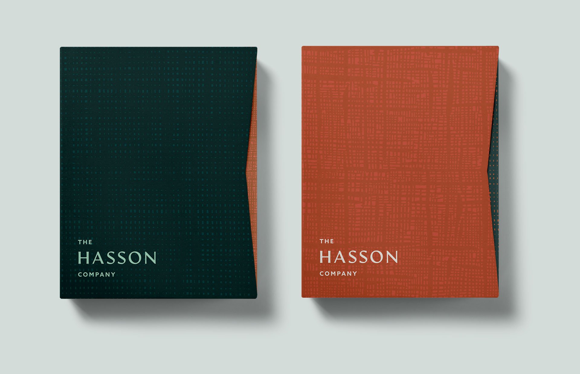
As we began our design process we noticed that the Hasson name had a beautifully balanced symmetry. Bookended by the two, strong vertical lines that make up the "H" and "N," the openness of the "A" and "O," and the repetition of the double "S's" this wordmark had everything we needed to create striking typographic patterns. These expressions, made from both the company name and the tagline further amplify the importance the founder has had on the company and culture.


