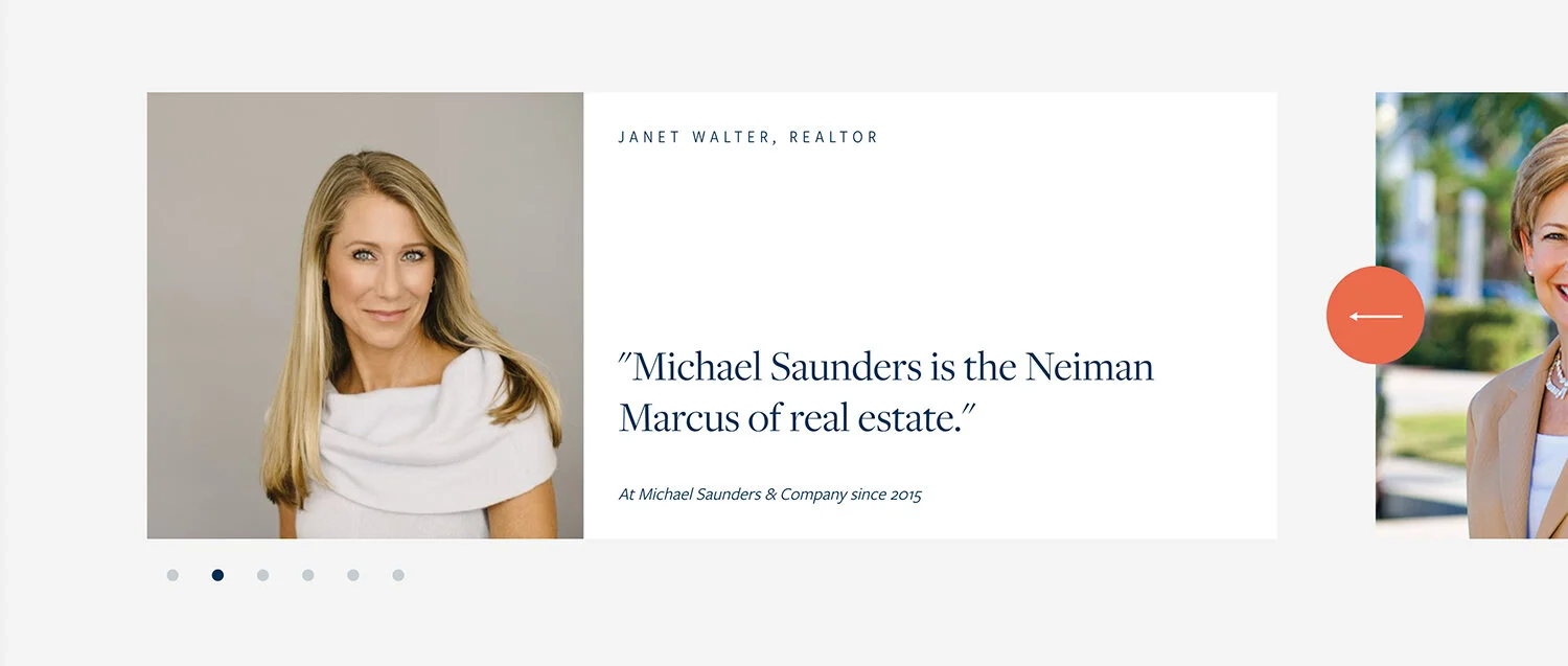
A literal icon in the real estate industry, Michael Saunders has earned every scrap of her esteem. I lived in Sarasota, FL a lifetime ago before I ever started my career. I didn’t know anything about the residential real estate business back then (nor did I care), but when I moved away, one of the things I could clearly recall was a Michael Saunders ‘FOR SALE’ sign and the designer scarves she was known for. Needless to say this project excited me.

Michael Saunders approached 1000watt with somewhat of an elusive ask. We knew the outcome they were looking for, but they didn’t come to us being able to clearly articulate exactly what they needed to do in order to get there. Over the years the Michael Saunders & Company brand had become corporate, cold and bland. After being on the ground for a week long discovery in Sarasota with leadership and agents alike, all of the brand strategy we developed after leaving could be distilled down to five simple words—put a scarf on it.

Using this mantra as both a benchmark for creative, and Northstar for strategy, I led the team as we created a multifaceted brand strategy and through the buildout of an expressive identity evolution. The work required an incredibly cross-disciplined approach. We wrote, we designed, we photographed, coded and painted… the whole time navigating and guiding the client team through the ins and outs of the work.
Because we were evolving the brand identity, there were certain tenants of the visual ID that we advocated against changing. The first was the iconic logo, the second being their primary color, navy blue. Neither of these are remarkable on their own, but there was a certain cachet in the region that we wanted to respect and build around.

Color
We started with the color palette by identifying supporting colors inspired by the region—these colors acted as catalysts to the navy blue and would offer the identity the jolt of energy it needed. I also wanted to take the idea of color beyond a set of defined HEX values and Pantone swatches. One only has to experience this region to understand that colors elicit experiences, and this geography was rife with them.
Dialing in the fidelity of these experiences offers us multiple ways to use and express color the way it is experienced in life.

Dynamic Color
Beautifully subtle gradients were created as part of the identity to suggest moments synonymous with region: sunsets, morning skies, reflections of boats on water and jade lagoons.

Texture
These textural elements acted as abstract impressions of nature and art. Fluid, moving, dynamic… these expressions reflected the area’s obsession with the fine arts and the natural world.

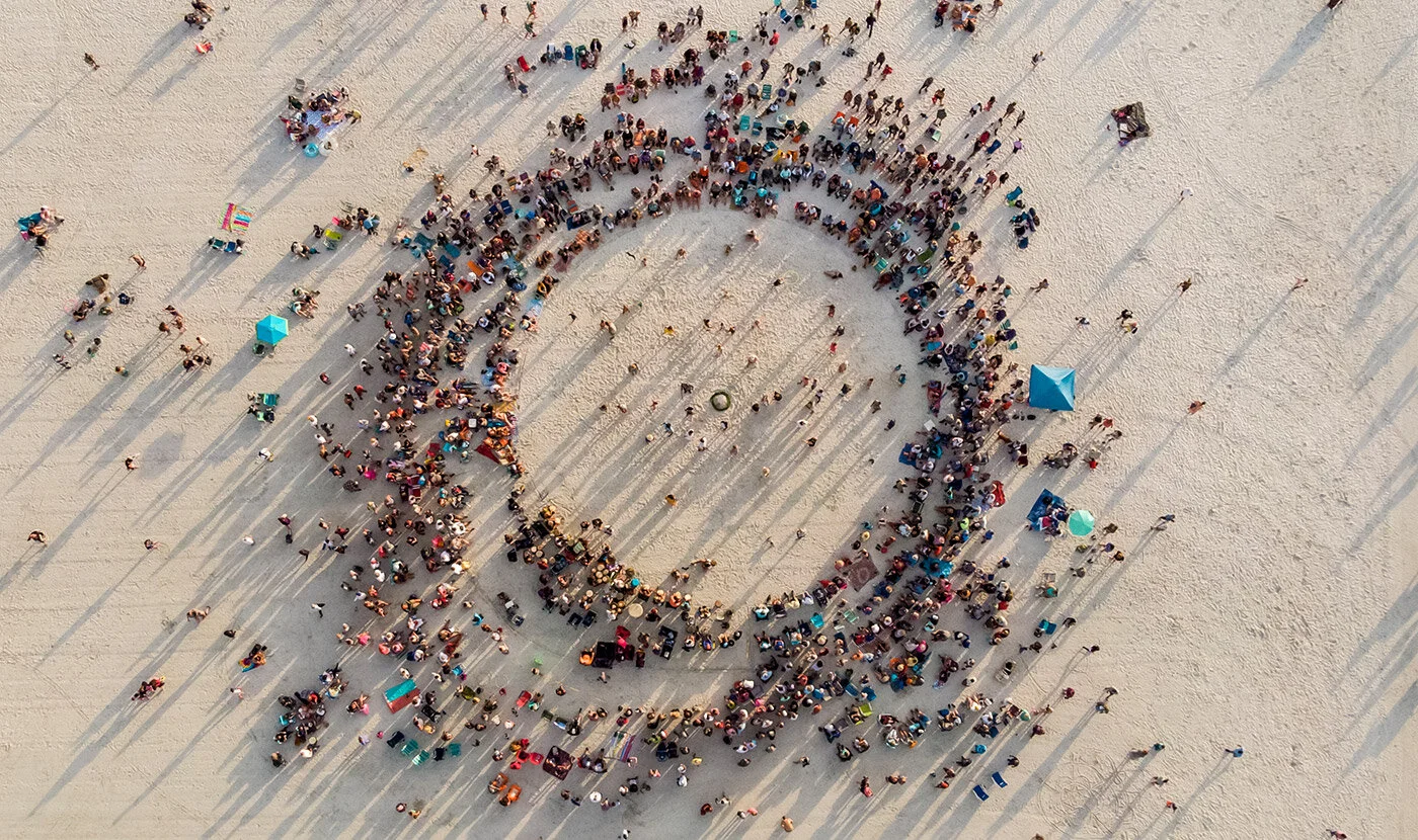
Aerials
All you had to do was look at anything from this vantage point to spark something deeply special. These 90 degree aerials were the highest fidelity of all the color impressions, bringing to life only what nature provided.

Art & Form
I knew that a certain level of rigidity would be needed to bring these elements together. We leaned way into the idea of these collages—impressions that married together color, texture and imagery. These asymmetrical grids would go on to be used everywhere, and offered the brand a way of storytelling that was anything but ordinary.

Illustrations
Very early on in discovery it seemed obvious to me that we had this really special opportunity to celebrate the iconic scarves of Michael Saunders. If we were going to ‘put a scarf on it,’ we needed the means to do so. Referencing the landscape, we created custom textile designs that would adorn some of the more expressive moments of the brand. Dialing up the amount of brand colors in any one illustration allowed us to adjust the volume of that impression with precision.


These assets caused so much excitement on the client side (as we had a feeling they would)—finding the right homes for them would end up being a really fun challenge. The way these elements would end up coming together was incredibly special and fulfilling for both our creative team and the client.


Life and Style
A focal point of the brand strategy for me was the opportunity surrounding photography. Michael Saunders & Company described their photography as lifestyle. I think we can all agree that this can be a loaded term. I made a huge case for us to break those words apart and honor them individually. ‘Real life’ can be beautiful all on its own, and because of this our imagery should strike the following chords: candid, relatable, authentic, natural, intimate. And considering the brand’s position and personality, those images should be refined with ‘style.’ Our images should be all of the attributes above, but also vivid, alluring and polished.
We spent another week traveling the region in an effort to build a body of work that would end up becoming an incredibly robust photography guideline for ongoing photoshoots throughout the region capturing not just the place and the people, but the special interactions between the two.


Nowhere but here.
Concurrently, I led the writers through the development of a new company tagline, and a messaging framework. The tagline ‘Nowhere but here’ surfaced through this exercise as a powerful call to attention that naturally took its place as the capstone of the framework, supported by these pillars:
Market Insights
A rich and extensive reach coupled with market dominance creates an undeniably powerful ability to shine light on things others are only guessing at.
Company = Personal Assistant
A carefully constructed network of services fills the need of a busy agent to hire a team of support roles. At Michael Saunders & Co., they have everything covered.
Agent Symposium
Collaboration is more than a buzz word. Technology and methodologies may change with time, but one thing that never loses its potency is the ability to work with others.
Network
Residential real estate in this region is particularly global. Deep, strategic relationships have been established with national and international affiliates ensuring visibility and connection.
Access
Barriers to leadership prevent important cultural ingredients from reaching the masses. Here, everyone has access to all leadership at all times as a means of connection.
Local Ingredient
This company, and even more importantly its leader, has been instrumental in shaping the appeal of the region. Engaging MSC means you are now part of that story.